How are we doing in our pursuit of diversity, equity and inclusion at Willy Street Co-op? Below you can find our goals and how we are measuring our progress toward them. Not only do we plan to update the metrics quarterly, we also expect to add and change metrics over time to better measure our progress. Updated 2.10.25.
Owner & Community Engagement
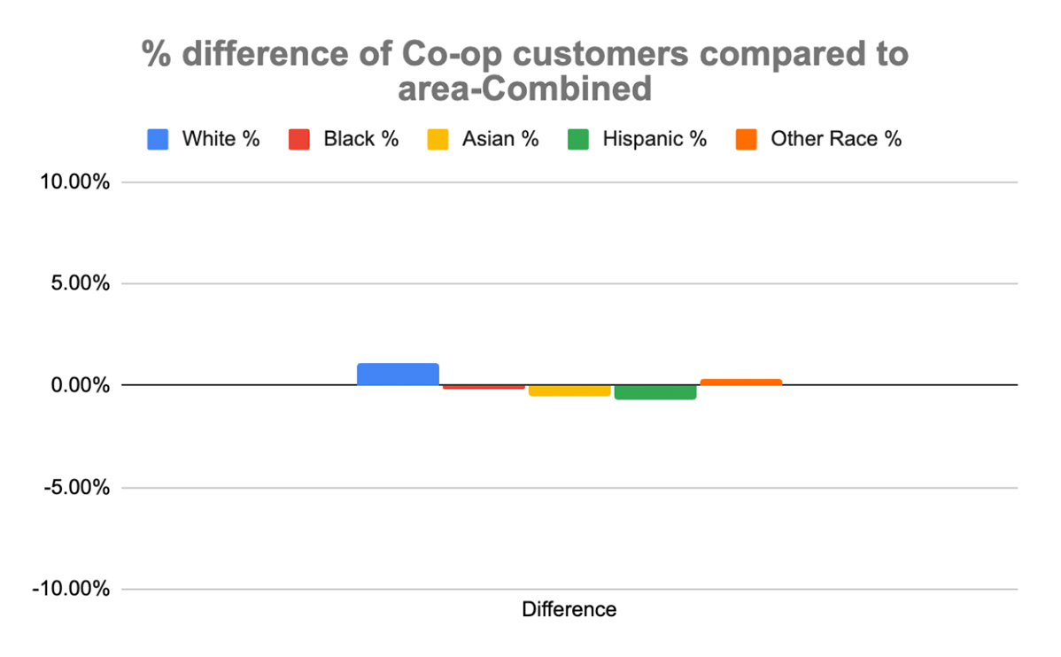
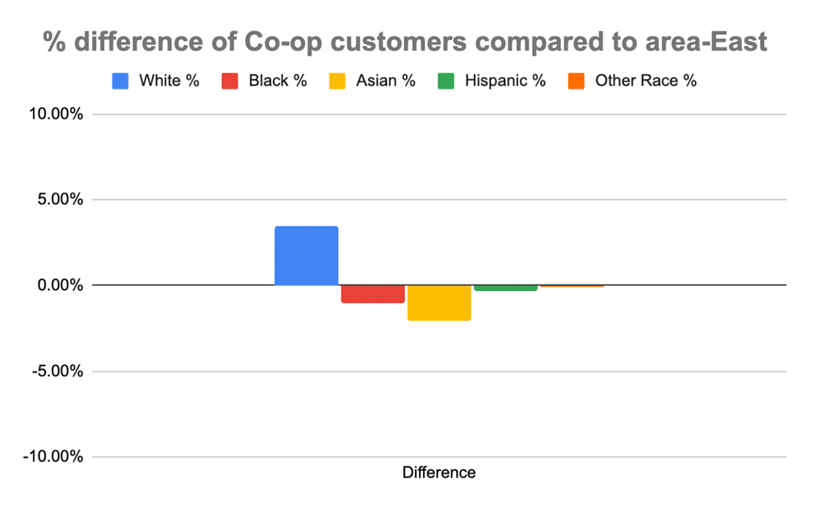
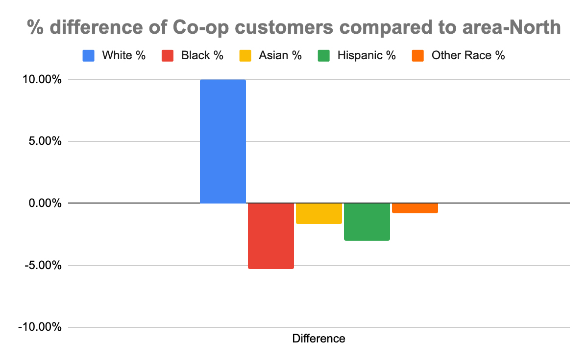
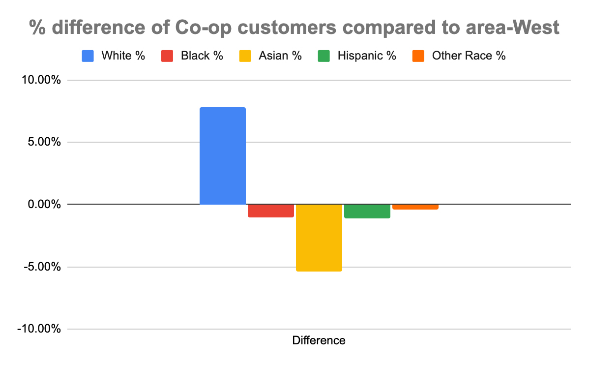
1. Our customers reflect the demographics of the communities we serve.
Why are we tracking this?
We want to see how and in what areas the ethnicity/race of our stores’ customers deviate from the ethnicity/race of the communities around the stores. Deviations may indicate that we are being unintentionally unwelcoming to certain customers, are not carrying products they may be interested in, or other factors.
What is shown by these charts?
In summer of 2022, we partnered with MTN Retail Advisors on a market study. MTN geocoded all customers provided by the Willy Street 2021-2022 list of transactions comprising approximately 12 months. They ran demographics for these areas to look for patterns and trends that identify the type of customer who likes to shop at Willy Street Co-op. They then limited the analysis to addresses within 150 miles from Madison, because any address outside of that range would not be representative of the core Willy Street customer.
MTN focused on these Household and Individual customers for further analysis since (1) they comprise 86% of the transactions and 90% of the sales, and (2) demographic data is connected to residential locations. There were 31,800 total household (HH) and individual customers, or 94% of the total customer count from the Willy Street Co-op.
MTN then looked at the demographics in the trade areas around each of the three Willy Street stores to look for market characteristics of the immediate neighborhoods around each store. This data is based on their findings. This data is based on their findings. We don’t expect to get a new market study for at least three years, but we are looking for other sources for this data so that we could provide yearly updates.
In each chart, the 0% line represents the race/ethnicity of each group in the given trade area; the bars show by what percentage our Co-op customer demographics are above or below. In other words, where are we over- or under-represented by race/ethnic group and by how much?
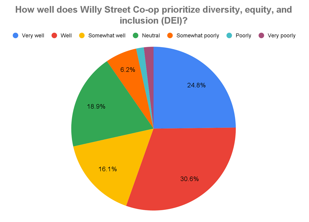
Why are we tracking this?
Owner perception of how much we are prioritizing DEI at the Co-op is one way to hold ourselves accountable.
What is shown by this chart?
This is the first time we’ve asked this question on a Co-op survey, so we are considering the 2023 Owner Survey responses to be the benchmark.
2. The Co-op is a place where our community participates and is proud to shop.
Why are we tracking this?
Customer Experience (CX) surveys are distributed to randomly selected customers at all three stores after a transaction. The customers are invited to complete a survey about their experience that day in exchange for a $5 coupon. We feel that completing a survey that asks for such feedback is one way to measure Owner engagement and participation (goal #2).
What is shown by this chart?
This chart shows the percentage of distributed CX surveys that were completed by customers of our three stores by month. We will be working on increasing the percentage.
For September and October of 2024, we have greatly increased the frequency of survey distribution at Willy North to gather more details about the experience of customers at that store in particular, and this is reflected by the chart.
What is our goal?
Starting with 2023Q4, always be increasing or maintaining the percentage each quarter. We achieved that goal for the quarter, with the survey response rate increasing at all three stores.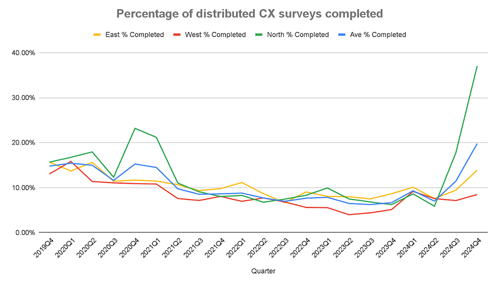
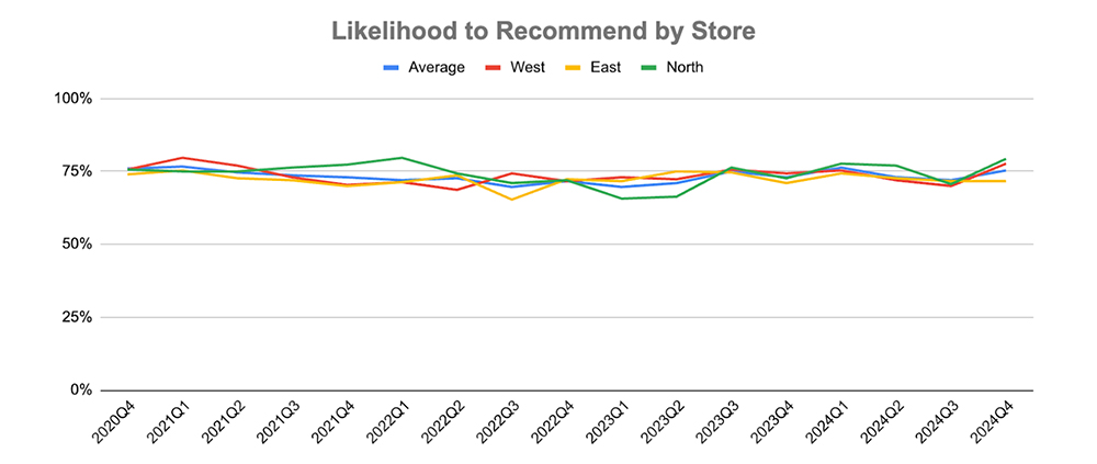
Why are we tracking this?
The CX survey asks how likely the customer is to recommend Willy Street Co-op to friends and family. We feel that measuring this is an indicator of how proud to shop customers are (goal #2).
What is shown by these chart?
The chart shows the percentage of respondents who rated this question a 5 on a 5-point scale, with 5 being “very likely to recommend.”
What is our goal?
The goal is the percentage of customers who gave us 5 out of 5 for “Likelihood to Recommend by Store” to increase or remain steady for each quarter. We achieved the goal this quarter, with Willy East’s score staying the same and the scores of the other two stores increasing.
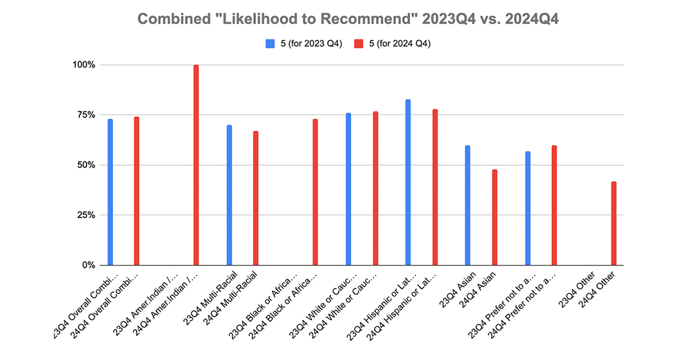
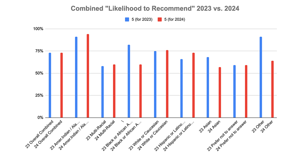
Why are we tracking this?
The CX survey asks how likely the customer is to recommend Willy Street Co-op to friends and family. We feel that measuring this is an indicator of how proud to shop customers are (goal #2). A secondary way we want to measure this data is by the background (ethnicity/race) of customers to determine where there may be discrepancies.
What is shown by these charts?
The two bar graph charts show what percentage of respondents, sorted by their answer to the “background” question, answered “5” on the five-point scale. The first of the bar graphs shows responses for the fourth quarter of 2023 for all three stores vs. responses from the fourth quarter of 2024. The second bar graph compares responses from all of 2023 vs all of 2024. No data in a column means that there were fewer than 20 respondents in that category, which could lead to an unreliable result.
Based on this data, we will need to investigate both what we are doing well, where the metric has increased and why the metric went down in some areas.
What is the goal of the metric?
Our goal for this one is for all BIPOC groups to meet or exceed the overall percentage. We did not achieve our goal in this quarter compared to 2023Q4.
Retail & Supply Chain Strategy
1. Increased focus on DEI in the Co-op’s vendor pool.
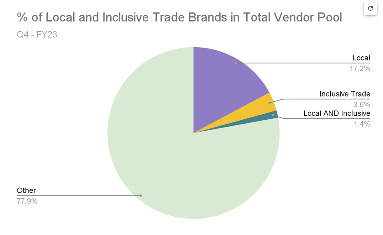
Why are we tracking this?
Our goal is to increase the number of Local and Inclusive Trade vendors and products we carry. Prior to the implementation of the Inclusive Trade program we had not tracked demographic information for our vendors. We’re planning to update this information annually.
What is shown by this chart?
The following charts show the proportion of Inclusive Trade and Local vendors in our total vendor pool for the fourth quarter of Fiscal Year 2023 (April-June, 2023). Local Definition: We define “local” as anywhere within 150 miles of the Wisconsin capitol building or anywhere in the state of Wisconsin.
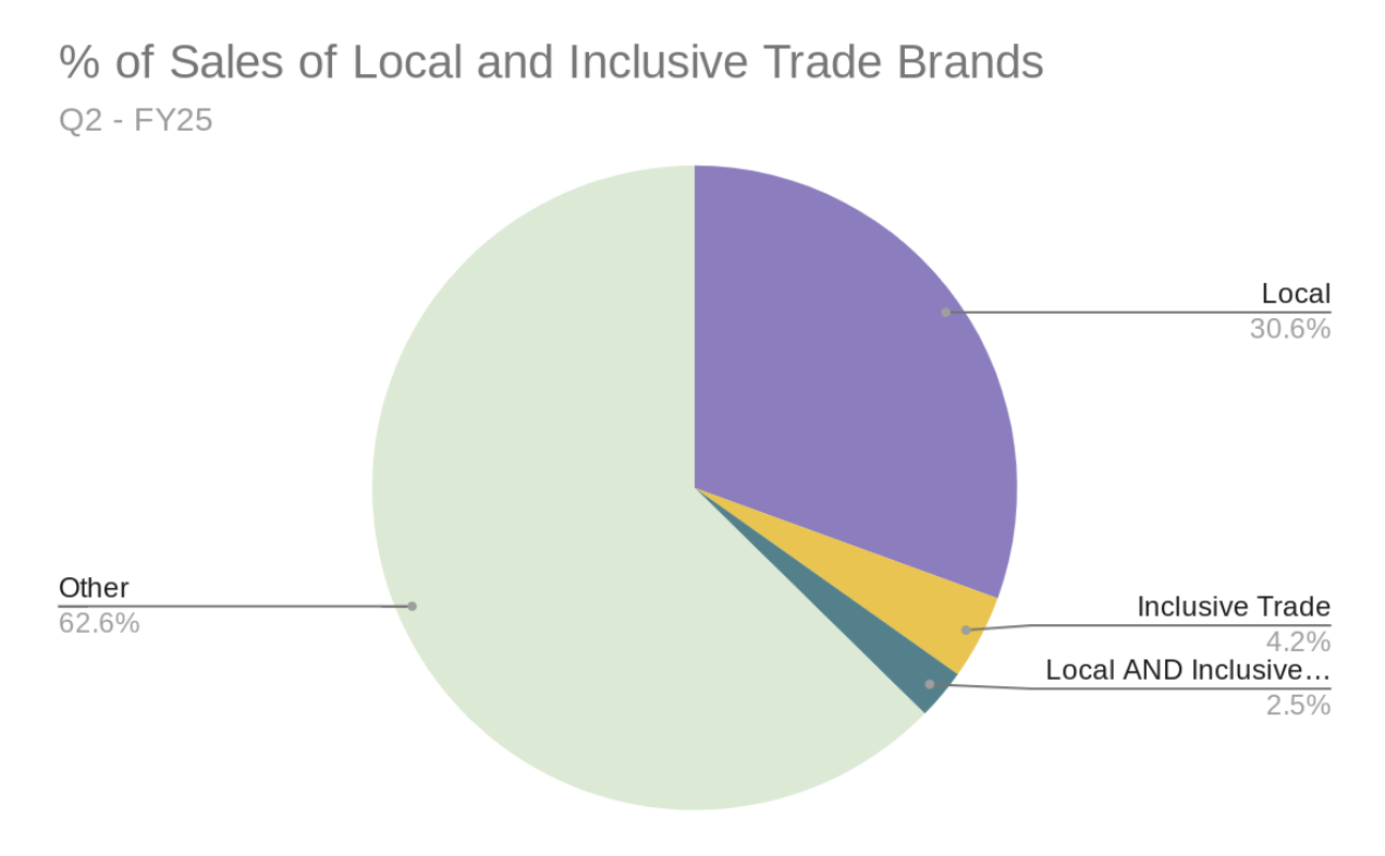
Why are we tracking this?
Our goal is to increase the sales of Local and Inclusive Trade products we carry. We’re planning to update this information annually.
What is shown by this chart?
The following charts show the proportion of sales of Inclusive Trade and Local Products as a portion of our total sales for the last quarter.
2. Product mix that is aligned with our brand identity while also reflecting the communities we serve.
Employee Engagement
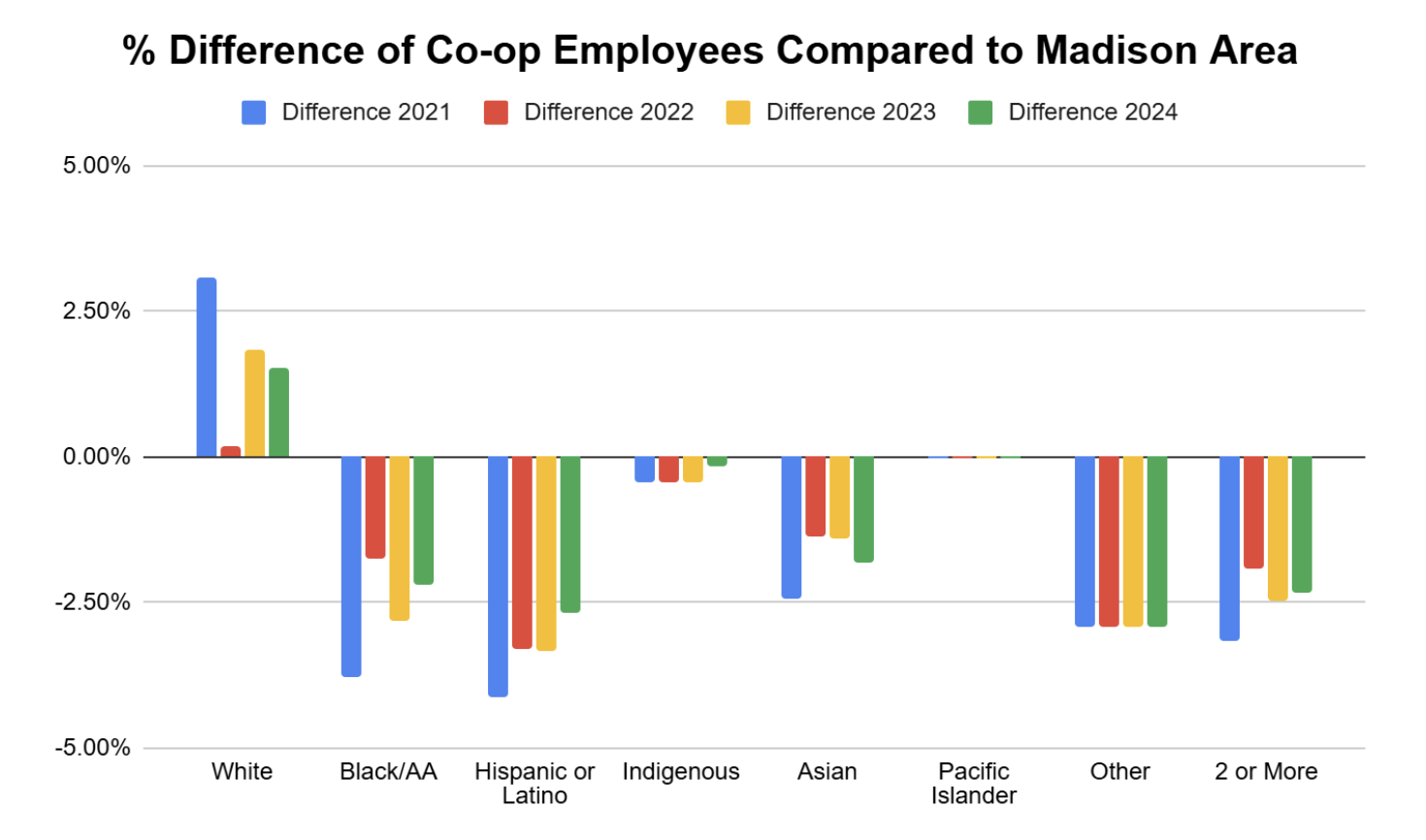
1. Our employees reflect the demographics of the communities we serve.
Why are we tracking this?
The Co-op desires to have a workforce that reflects the demographics of the communities we serve.
What is shown by this chart?
Willy Street Co-op employee racial demographics % difference compared to Madison Area as of December 31 of each year since 2021.
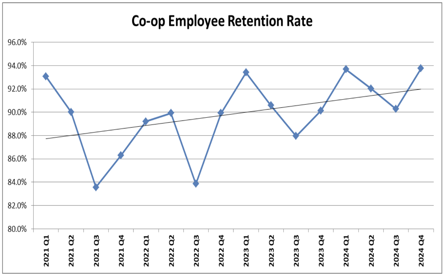
2. We will become an employer of choice through a culture of acceptance, inclusion, and respect.
Why are we tracking this?
The Co-op wants our employees to stay with us and continue to grow. To evaluate how many employees stay at the Co-op, we analyzed the employee retention rate.
What is shown by this chart?
This chart shows the employee retention rate by quarter since January 1, 2021. Retention rate is the percentage of employees who were still actively employed at the end of the period compared to the start of the period. The average retention rate for 2024 for the retail industry is 64.6%.